If you’ve read our previous post on Exploratory Data Analysis (EDA), you already know that understanding your data is a whole lot more than generating a few summary statistics. But now, let’s take that exploration a bit further — from a surface-level scan into a more structured, thoughtful analysis.
To be honest, this part of the process is often rushed or oversimplified. The literature may not always go deep enough — that’s why it’s crucial to pair your EDA efforts with supporting references and real-world context. That said, let’s break down what should actually happen once you’ve clarified your research objectives.
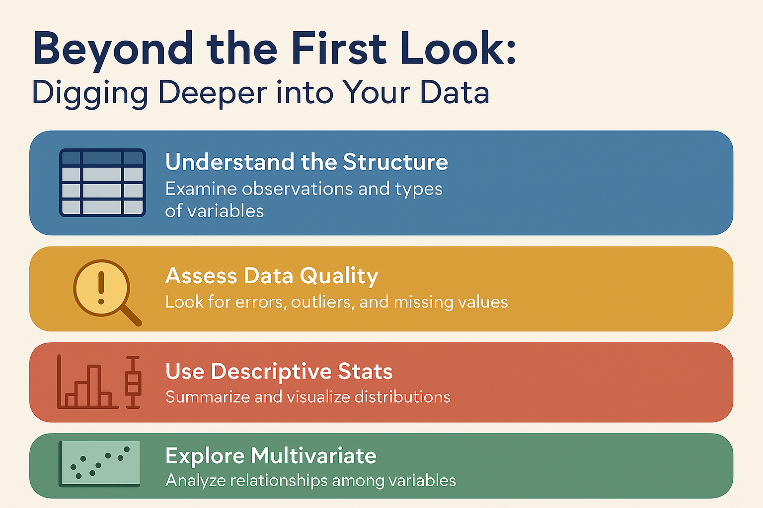
The first thing you need to do is get familiar with the structure of your dataset. Don’t just look at how many rows (observations) you have — look at how many variables there are and what types they are: continuous, discrete, binary, categorical, and so on. This structural awareness sets the stage for everything else.
⚠️ Important Reminder: You must know how the data was collected. This knowledge influences everything from assumptions and validation to how you interpret the final results. Whether it’s a random sample, observational data, or survey results — knowing the origin makes or breaks your analysis.
Checking Data Quality: Don’t Skip This
Once you’ve understood the layout, it’s time to assess quality. You’ll want to look for common issues like errors, outliers, and missing values. Outliers, for instance, are data points that just don’t fit the general pattern — and they can really skew your analysis. There are statistical tests to identify them, but if you’re unsure, it’s always a good idea to ask someone familiar with the subject matter. Sometimes what looks like an outlier is actually an expected extreme.
Descriptive Stats: Your New Best Friends
Next up: descriptive statistics. Think of this as building a statistical snapshot of your dataset. This usually includes mean and standard deviation, both overall and for any subgroups that matter for your analysis.
But don’t stop at numbers — visualize your data. Use the right charts for the job:
- A histogram shows how your data is distributed.
- A stem-and-leaf plot gives similar information but includes actual data values.
- A boxplot (also called a box-and-whisker plot) makes it easy to compare distributions across groups — the box shows the interquartile range, and the line inside marks the median.
Visualizations can instantly reveal patterns that might take pages of numbers to notice. For example, if you compare two samples using histograms or boxplots, you can often tell whether they follow a normal distribution (symmetrical) or something else like exponential (right-skewed).
And if your groups look similarly shaped, that’s your cue to check their means — maybe through a simple one-way ANOVA before diving into deeper tests.
More Powerful Charts for Deeper Insight
Two other plots are key in your EDA toolbox:
- Scatter plots help you see relationships between two variables — essential for regression.
- Time plots show how one variable changes over time — perfect for time series forecasting.
📌 Pro Tip: Any plot or table should come with context. That means: add titles, axis labels, and units. Don’t make your reader guess.
Now We’re Talking Multivariate
When you’re working with more than two variables, things get more complicated. Descriptive stats alone won’t cut it. You’ll need to start thinking about how variables relate to each other — using correlation matrices and multiple scatter plots, for example.
But be cautious: scatter plots in multivariate contexts can be misleading. This is where we start shifting into more advanced territory, which we’ll explore in future posts — like multiple regression.
Still, even at this stage, there are powerful modern techniques that don’t rely on heavy probabilistic modeling. These include:
- Principal Component Analysis (PCA)
- Cluster Analysis
- Multidimensional Scaling (MDS)
These methods help reduce high-dimensional data into two dimensions, making complex relationships easier to visualize and interpret — perfect for big datasets where traditional methods fall short.
So, what’s the takeaway? EDA isn’t just a set of tools — it’s a mindset. From checking your data’s background and structure to digging into visuals and exploring deeper statistical patterns, good analysis starts long before you hit “Run” on your model.
Up next, we’ll unpack how these insights transition into model-building, hypothesis testing, and predictive analytics. Until then — explore boldly!
This post is inspired by Chris Chatfield’s classic 1986 article, Exploratory Data Analysis, published in the European Journal of Operational Research. It’s a brilliant primer on how to use EDA to bridge the gap between raw data and real-world insight.
📘 Reference:
Chatfield, C. (1986). Exploratory Data Analysis. European Journal of Operational Research, 23, pp. 5–13.
Leave a Reply